


When you walk into a room, what happens? What do you feel? What do you respond to? Are you affected by the color? Do you notice the light? How does your mood change?
According to Leatrice Eiseman, Executive Director of the Pantone Color Institute, the first thing a person notices is color, and it is the last thing remembered when leaving a room. Although the eye receives light waves of different frequencies, that information is carried to the brain where color is actually perceived. The pituitary gland, responsible for the release of hormones, is indirectly affected during this process. So, evidence suggests color triggers hormonal responses! Isn’t that amazing? The body is having an unconscious physiological response to the color. Regardless of personal tastes, color can have an effect on you, the viewer. A soft green is known to reduce stress hormones, thus calming the body.
A strong, bright red may increase the heart rate. Embedded natural responses to color reside deep in our DNA. Think you’re immune to the power of color? Unless you have a color vision deficiency, you’d be wrong. By the way this holds true for someone with normal or standard color vision. If a color vision deficiency exists, then all opinions are rendered worth reconsidering. The home you live in. Your place of work. The clothes you wear. All day long we are surrounded by color and we are responding, consciously or not. So, why not take control of this? By controlling these choices, there is strong evidence that energy can be altered and moods can be shifted. There is a surprising dearth of color awareness which I believe comes from “chromophobia.” Said simply, a fear of color. Because people fear color they don’t use it. And, while I almost understand that fear, almost, let’s change it! Harnessing the power of color can offer so many new options. Color is powerful. Color is exciting. Color is fun!
Moodology
The psychology of color is a critical element when creating a living space. I’m always trying to determine what the colors say. Blue is considered reliable; it’s also the most universally popular color. Green is the most gender-neutral color, while red is bold and passionate. Orange is happy, black is powerful, and purple regal and creative. All of these references are important in a sweepingly-generalized way, but what’s more important is how the client, the end-user, reacts or responds to color.

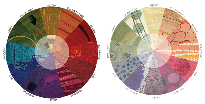
A color wheel is an abstract illustrative organization of color hues around a circle, which shows the relationships between primary colors, secondary colors, tertiary colors. In this example rugs designed by Keshishian illustrate a fully saturated color wheel. Below: Shades of color as illustrated by rugs designed by Keshishian. Shades are created by adding black (left). This color wheel again uses rugs designed by Keshishian to illustrate the concept of tints of a hue. Tints are created by adding white (right).
Violet may seem like the perfect solution to a design, but if violet has negative connotations to the client—social, personal. arbitrary, or otherwise—that supersedes any broader references and is crucial to consider. (My brother couldn’t abide purple because a local religious cult adopted widespread use of the color). Cultural and regional influences are also important when selecting colors because every culture has nuanced reactions to color meaning. While red may represent happiness in China, it can denote mourning in South Africa. Thus when designing, all of these elements need to be considered for a successful outcome. We have every opportunity to enhance our lives and color is one way to do just that. Clients will live with the selected colors every single day. It’s critical that they are satisfied and live in a way which reflects their own true sense of comfort and beauty.
And, while it’s not often discussed, color is strongly associated with class structure. To quote an old friend, “color is so suburban.” I’d like to challenge that broad stroke of ‘urban,’ or is that purportedly civilized, elitism by arguing that color doesn’t have to signify simply “cheap and cheerful.” Likewise, “quiet and elegant” doesn’t have to mean monotone (or is that monotonous) neutrals. I think it’s time we stop restricting the color card and consider broadening our self-imposed limitations associated with color. The use of color should not be reserved for the so-called tasteless, nor artists alone.
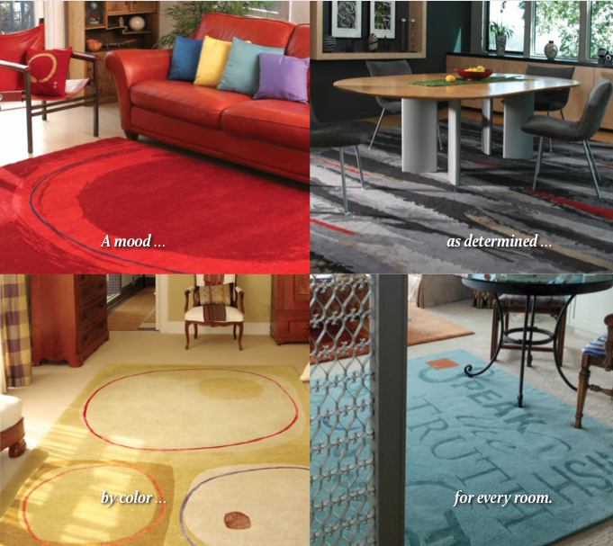
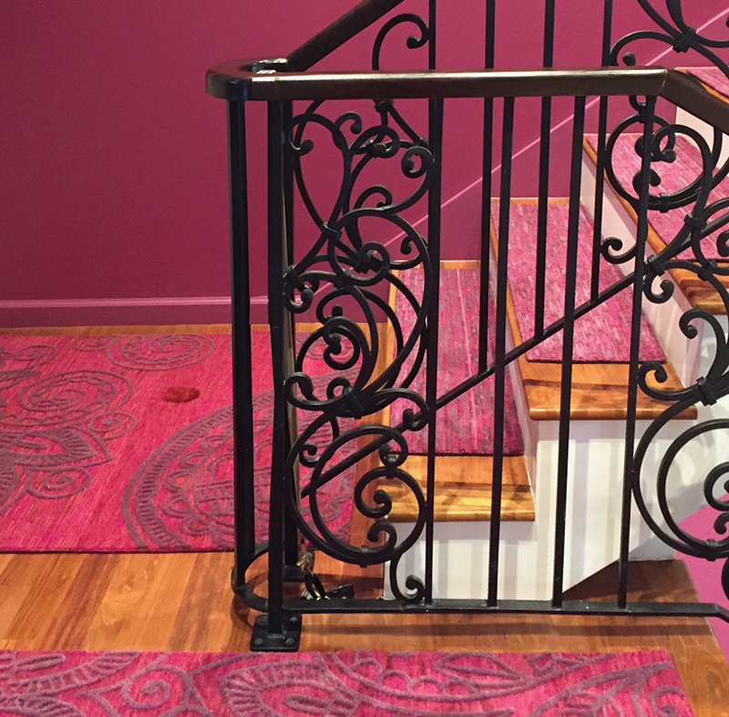
Walk into a room and one of the largest visible furnishings is carpeting, either wall-to-wall or an area rug. It’s a perfect vehicle by which to communicate and influence. As already mentioned, this is an opportunity to make a statement, and that statement can range from quiet to bold. Is the room active? If so, perhaps use highly chromatic, that is, saturated colors; perhaps strong contrasts. Complementary colors, also known as opposite colors, can create a harmony which will energize the space. The use of bright bold colors can uplift the space, creating excitement. On the other hand, if it’s a quiet and serene space, perhaps a bedroom, then consider colors in the same value range or monochromatic colors. Work with tonal steps and consider textural variety by utilizing different weave structures or reflective silks. If a design has multiple textures of the same color the variety can actually be perceived as multiple highly-related colors.
Color is not seen in isolation. The relationship one color has to its adjacent color is paramount, with color proximity dictating how a color is perceived. That’s what starts the conversation in a space. If there are many colors randomly placed throughout the room, or even in a wardrobe, the eye will naturally bounce around creating an active experience. However, a properly-designed, visible roadmap of color can lead the viewer through space, with design choices further controlling the flow of one’s eye. Color, when used wisely, supports a space without disruption and moreover, it can be a driving factor to a joyful experience.
Neutrals
Far too often neutral colors are chosen for the simple reason they are neutral. That is, they don’t “say anything," evoke scant excitement, and take little consideration. They may, in fact, play well with others, but they are noncommittal. When used without thoughtful consideration, those neutrals can result in a dull environment because they don’t make a statement. Fear often dictates the easy, safe selection of beige or grey, but easy is rarely the right choice. At least make a decision based on a direction that’s uplifting. Complicated neutrals become infinitely more interesting when the undertones are properly paired with colors that establish a dynamic relationship. Beige and grey trends swing back and forth on the popularity pendulum depending on other current trends which, despite flawed assumptions about color and design, are a result of economic, cultural and sociological conditions.
“If a design has multiple textures of the same color the variety can actually be perceived as multiple highly-related colors.“
If a client says they like the natural earth tones of beige or brown, by all means integrate beige elements and consider how to improve the beige to add depth. In addition, think of the innumerable “natural colors” available! The myriad greens found in nature, with more variety than any of the other hues, are excellent alternatives without sacrificing that natural connection. What could be more natural than referring to the boundless number of foliage colors? Start with the variety of wood colors ranging from a lovely honey-colored fir to rich dark oak, then throw in an accent of pumpkin. Already a dull neutral palette has been elevated while remaining a solidly natural palette.
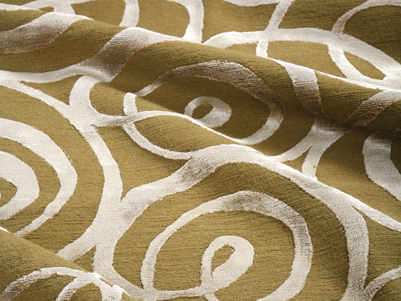
In the rug ‘Onnie’ by Keshishian, the design incorporates two textures and materials of the same color—a tight wool loop pile field and a raised cut pile silk motif. With different viewing angles or lighting conditions the colors appear not only different but create a luscious textural variety.
Neutral colors have been wildly overused to create supposedly comfortable spaces, yet this comes at the sacrifice of our knowledge of color. For example, one of the most disturbing uses of neutrals today is in retirement communities. Designers, unknowingly, are creating spaces which present challenging living conditions as the average 80-year-old client needs approximately six times more light than one in their twenties. As we age, the lenses in our eyes naturally develop a yellow cast.
This, in turn, impacts how an aged population perceives colors, especially blues and purples. So, while a designer might think the muted beiges or lavenders look nice and relaxing, the lack of contrast actually makes navigation in the space profoundly difficult. Consider for a moment how difficult it would be to move safely through Beigelandia with its beige rug, beige sofa, beige chair, beige walls, et alia when your eyes cannot easily differentiate between them all. Contrast makes it easier to understand space, and so moving in space becomes less fearful with its use.
In homes where people live with declining vision or dementia, there can be a sense of isolation and fear. Spatial recognition becomes trickier and potentially dangerous. This is especially true in bathrooms. You know that elegantly designed all-white bathroom replete with white tiles, white toilet, white sink, and white floor? Same as Beigelandia—it creates havoc and a lack of confidence because people are unable to see the fixtures. Designing a space with more awareness can lead to a more fruitful and independent lifestyle when so many other life options have been reduced. Rug and carpets can also be a great tool to help with wayfinding in public spaces. The contrast between hard flooring and a soft rug is further highlighted through an appropriately dissimilar—yet visually appealing—color selection.
Light and Perception
Since color is in truth light, the region where we live impacts how we see and perceive color. Countries with strong sunlight, closer to the equator, usually exhibit a strong palette of bold colors, often called friendly, open colors. That’s because the intensity of the light itself reduces how colors are actually perceived. Those same colors, in countries further from the equator, with low light, might seem a bit garish and out of place. When living further away from the equator, where the light dissipates, there’s a wonderful opportunity to integrate those equatorial colors in order to lift the spirits. A shot of orange as an accent can be enough to make someone smile and feel warm and fuzzy. And the opposite holds true as well. If living in a hot climate with unrelenting direct sunlight, creating a cool sanctuary could be the perfect solution to ease that constant bombardment of heat and sun. Take cues from these palettes to bring additional vitality to any space. If you need a sanctuary—a safe space to relax at the end of the day—gentle colors are a good choice. If you have a space that needs high energy—for entertaining or manufacturing—strong, warm colors are a wise direction.
“Sophistication and compelling individuality can be conveyed with judicious color choices.“
A client once referred to an appealing pale aqua carpet as neutral. When I pointed out that the “neutral” carpet was in fact blue and not neutral, I was able to suggest that the use of analogous—alike—colors had produced a soothing sensation which she interpreted as neutral. I found that fascinating. To clarify, it told me was she was interested in something serene: not too much contrast; nothing too busy. We found a way to integrate color into her life without forfeiting the calm earthiness she craved.
Designing Rugs and Carpets When designing a custom rug my job is to satisfy the needs and wants of a client. To facilitate this, I first meet them and then look and listen very carefully. There are a series of questions that I silently answer. What is the age of the client? Are there children using the space? Is the room active or quiet? Then my considerations come into play, foremost, of course, is color. Colorways are like little stories. Everyone has a story which includes their personal color palette. What is the intention? What is needed? Which room will the rug live in? Is the room a sanctuary? Does the space need energy? Then begins the process of interpreting the information into a story which translates into a color direction and eventually a design. Playing with pattern is just a vehicle for color. The hue family is the dominant piece of information. Where will the accent colors appear? How will the colors relate? Which colors will be the accents? Where is the surprise?
‘Hamsa’ by Keshishian shown with a wool loop pile field with raised cut pile wool and silk motifs. The closely similar colors of the field and motif allow for highly nuanced interpretation of color depending on lighting or viewing angle.
Using color doesn’t mean it has to be bold or dramatic. A request for a blue carpet could mean anything from a pale, quiet, low-value, low-chroma blue hue to a fully-saturated, highly-chromatic blue. It can be used prudently yet still be considered tasteful and elegant. Use color sensibly, and the mood lifts and a personality starts to emerge. Create a space which represents the person inhabiting that space. Sophistication and compelling individuality can be conveyed with judicious color choices.
Images courtesy of Alicia D. Keshishian
Alicia D. Keshishian is an award-winning art director, graphic designer, illustrator, surface designer, and color consultant with more than 40 years of professional experience. Alicia descends from a family of Armenian rug merchants and is currently a board member of the Color Marketing Group leading the education program. Keshishian continues to increase her knowledge of color through various educational pursuits while continuing to make art in her Northern California studio. She produces a line of custom, hand-knotted made-to-order carpets and is a presenter on color and rug production. Rug Insider thanks her for her insight.