 and Glass")
Though Alicia Keshishian comes from an Armenian rug family well steeped in the trade of quintessentially ‘oriental’ carpets, her aesthetic is decidedly modern. RUG INSIDER talks with the rug designer and color expert to gauge what defines—or often redefines—an aesthetic.
Depending on the source, the period of design now known as ‘Mid-Century Modern’ can narrowly be defined by its most important era, from 1955 to 1965. But it can also include the post-war pre-space-race era from 1947 to 1957, or even refer to the whole period from 1933 through 1965. As Alicia Keshishian wrote in preparation for this discussion, ‘Any way you look at it, Mid-Century Modern landed and has stayed relevant or should I say popular—ever since.’
‘My rugs have always been custom.’ begins Keshishian, ‘I have never designed for a specific style but have intuited what my clients like and are drawn to. Since I am designing for current spaces these patterns reflect my clients’ taste and were not intended to copy, or even mimic, Mid-Century, yet they are reminiscent of the times by their play of shapes and patterns. Bold orbs, ovals, geometric [angular] shapes. Frequently my clients have original Mid-Century furnishings so I naturally gravitated to these forms.’
Part of the enduring appeal of the Mid-Century Modern style is that, coming on the heels of World War II, that post-war joy was manifesting itself in gleefully inspired furnishings and architecture. It was a period in which form-follows-function grew and beauty became an important companion to functional pieces. ‘Living in and amid beauty was no longer just for the wealthy but became available, and desired, by middle class Americans. Home was the epicenter, where family and entertainment were relished.’ says Keshishian. ‘Along with the importance of form-follows-function came delight. While design was increasingly important in architecture, furniture, and graphics, the serious intentions were frequently injected with a dash of whimsy. This kept the cerebral atmosphere from being taken too seriously.’
The aesthetic as it is today is an amalgam of true-to-the-period time capsules and contemporary interiors whose inspiration is drawn from those original spaces, often refined and adapted to the needs of this time and place.
’Everything is modern in its time.’ Keshishian reminds. But while forms and furnishings have evolved, one defining characteristic remains true: the empowered use of color.
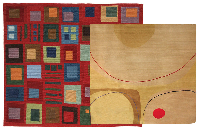
Carpets of Imagination: Mosaic (left) and Tybee.
The color palette for Mid-Century evolved throughout the years, retaining its original modern feel, yet evolving in charmingly whimsical ways in order to remain current. ‘It’s perhaps best known for the gold, avocado, orange, and aqua of the fifties. Throw in some neutrals like charcoal, mid-grey, or off-white and the defining palette was fully rounded.’ according to Keshishian who, as a board member of the Color Marketing Group, is well versed in its applications and trends. ‘But each decade put their own spin on the palettes. If you look at interiors, you’ll see a wide variety of color combinations. Some are quite surprising! For example, forest green offered as a base note anchoring some of the other colors, or paired with its compliment of red for dynamic contrasts.’
Further combinations of colors recall the joy, love of life, and touch of whimsy that are emblematic of the look. ‘There were some delicious analogous color schemes,’ says Keshishian. ‘Citron, lime, aqua, and forest palettes with a sweet melon color thrown in, or dusty blue, jade, periwinkle, and faded indigo all the same value.’ The latter group is calm, sophisticated and elegant yet with colors so delightful that it is simply pleasing to the eye. ‘Tomato and orange/rust with teal as the surprise accent; utilizing a light cream as the unifying color. Back to the forest green—there were also charcoals and ‘almost black’ colors which have come back into popularity. They offer depth and solidity while providing a good foundation. They speak well with other colors!’ declares Keshishian.
‘And what of your statement that trends fuel the economy?’ I ask of Keshishian as we discuss how color, style, zeitgeist all play into defining and revisiting style. As I ponder whether knowledge of historical reference is pertinent to trends, Keshishian interjects, ‘I don’t think trends segue directly into historical reference, and that doesn’t seem like the right answer to the question.’ And she’s right. Not because people aren’t intelligent or well studied, but simply because of varied human interest. This is the reason specialized professions exist, the reason people hire architects, designers, colorists, and in the case of Keshishian, bespoke rug designers with a comprehensive knowledge of color, of historic reference. Just as one might care to learn the history of Mid-Century Modern design, it's not necessary in order to appreciate the look. When Keshishian, and arguably many others, design rugs, they are distilling all of what was Mid-Century into an updated style suited for today. That can hold true whether the designs are bespoke or take-home-today.
‘The home should reflect the homeowner.’ says Keshishian of her approach to designing rugs, before adding, ‘Color has the ability to help define space.
Color is always in the forefront, the first and guiding design element when working with clients. Once color direction is established we can focus on the myriad other details.’
Looking backward, it is relatively easy to see the direction consumers gravitate toward over time, to spot trends that eventually define a genre in retrospect. Promotional trends of today by contrast look at the current moment in an attempt to divine where consumption is headed, often focusing on what colors will be en vogue. ‘It always seems a bit manufactured to me.’ I say before Keshishian advises, ‘When I am designing a rug for a client I listen to their interests, look at their space, their taste, furnishings, whether the space feels sleek, and many times an existing palette the rug needs to fit into. Often I’ll add a current trend color to the existing palette to make it relevant to now.’
‘Just as music represents a generation, so does pattern. And so does color. Color is a profound reflection of the times. What is going on politically, economically, socially—all these elements are blended together to reveal, in retrospect, an aesthetic archeology of the period.’ writes Keshishian, who continues: ‘Incorporating patterns but adapting colors to our current aesthetic is one way to bridge contemporary style with classic Mid-Century. Colors come and go in trends but it’s new relationships that keep colors fresh. The lighter shade of green with a yellow undertone may replace a dark, dank forest green—yet still pair with a tomato red. Instead of avocado, the shade of green may be a brighter, cleaner hue versus the slightly muddy value of avocado. When pairing colors with the iconic pale aqua or light teal maybe melon shifts toward the warm tone accent to a more lively berry?’
Throughout the period the tone of the varying woods and wood stains impacted how colors were used and a color’s undertones could shift to enhance the wood tones near it. Mid-Century Modern was in love with wood, pattern, and texture. Wood was constant in many of the interiors, used to provide an earthy connection. Pattern developed from space-race iconography with simple bold graphics. Texture in the form of barkcloth, nubby fabrics, thick carpets. ‘The sleek, modern interiors, were inviting environments for [beautifully designed] furniture, furnishings and carpets. Carpets are one area where texture was highly visible.’ Keshishian says.
In contrast to the carpets Keshishian has designed—with the benefit of historic reference—to complement existing Mid-Century inspired spaces, many of the carpets used at the time were of various origin and not necessarily what one might expect. In ‘The Rugs and Carpets of Fallingwater’ (page 34), readers learn Moroccan carpets were all the rage in the late 1930s. For a specialist such as Keshishian, this is no revelation. Armed with this knowledge, Keshishian incorporates texture into her carpets, even if it is not the expected classic ‘shaggy’ texture. For example, by creating a tight loop pile knotted using handspun yarns, modern-day carpets can express rich complicated surface textures reminiscent of the bark cloth and knobbly linens of the 1950s; textural elements updated to be modern today.
‘As we are living now the trick is to create designs that are compatible with the classic Mid-Century styles, yet are relevant to today. Incorporating patterns but adapting colors to our current aesthetic is one way to bridge contemporary style with classic Mid-Century,’ states Keshishian. For the homeowners of 1933 to 1965, the defining desire was for beautiful surroundings that were also functional. Whichever ways designers like Keshishian choose to emulate or incorporate Mid-Century style into their own designs, rugs and carpets are a livable and elegant example of both beauty and function.
www.adkcarpets.com
Images Courtesy of Alicia Keshishian.